Back when I was writing a great deal about QlikView, I proposed that its fundamental value came from empowering business analysts to do work for themselves that would otherwise require IT support. (See, for example, this post, which has the virtue of pretty graphics.) This same notion of considering which users do which work has permiated my ideas of usability measurement for demand generation systems and usability in general. But to get back specifically to business intelligence systems, I think there is a particularly large gap between the capabilities available to business analysts and those available to IT. That is, even though the business intelligence systems like Cognos and Business Objects give analysts many ways to slice and present prepared data, they do not let analysts add new data or restructure existing data to meet new needs. This still requires the IT staff to design new data cubes and loading processes.
This gap is partly filled by analytical technologies such as columnar systems and database appliances, which can give good performance without schemas tailored for each task. But those systems are purchased and managed by the IT department, so they still leave analysts largely reliant on IT’s tender mercies.
A much larger portion of the gap is filled by products like QlikView, which the analysts can largely control for themselves. These can be divided into two subcategories: database engines like QlikView and illuminate, and visualization tools like Tableau and TIBCO Spotfire. The first group lets analysts do complex data manipulation and queries without extensive data modeling, while the latter group lets them do complex data exploration and presentation without formal programming. This distinction is not absolute: the database tools offer some presentation functions, and the visualization tools support some data manipulation. Both capabilities must be available for the analysts the work independently.
This brings us to ADVIZOR from ADVIZOR Solutions. ADVIZOR features an in-memory database and some data manipulation, but its primary strength is visualization. This includes at least fifteen chart types, including some with delightfully cool names like Multiscape, Parabox and Data Constellations. Analysts can easily configure these by selecting a few menu options. The charts are also somewhat interactive, allowing users to select records by clicking on a shape or drawing a box around data points. Some settings can be changed within the chart, such as selecting a measure to report on. Others, such as specifying the dimensions, require modifying the chart setup. The distinction won’t matter much to business analysts, who will have the tools build and modify the charts. But final consumers of the analyses typically run a viewer that does not permit changes to the underlying graph configuration.
On the other hand, that in-memory database can link several charts within a dashboard so selections made on one chart are immediately reflected in all others. This is arguably the greatest strength of the system, since it lets users slice data across many dimensions without writing complex queries. Colors are also consistent from one chart to the next, so that, for example, the colors assigned to different customer groups in a bar chart determine the color of the dot assigned to each customer in a scatter plot. Selecting a single group by clicking on its bar would turn the dots of all the other customers to gray. Keeping the excluded records visible in this fashion may yield more insight than simply removing them, although the system could also do that. These adjustments appear almost instantly even where millions of records are involved.
Dashboards can easily be shared with end-users through either a zero-footprint Web client or a downloadable object. Both use the Microsoft .NET platform, so Mac and Linux users need not apply. Images of ADVIZOR dashboards can easily be exported to Office documents, and can actually be manipulated from within Powerpoint if they are connected to the underlying dashboard. It’s also easy to export results such as lists of selected records.
Circling back to that database: it employs technology developed at Bell Labs during the 1990’s to support interactive visualization. The data model itself is a fairly standard one of tables linked by keys. Users can import data from text files, relational databases, Excel, Access, text files, Business Objects or Salesforce.com. They can map the table relationships and add some transformations and calculated fields during or after the import process. Although the mapping and transformations are executed interactively, the system records the sequence so the user can later edit it or repeat it automatically.
The import is fairly quick: the vendor said that an extract of three to four gigabytes across thirty tables runs in about twenty minutes, of which about five minutes is the build itself. The stored data is highly compressed but expands substantially when loaded into RAM: in the previous example, the three to four GB are saved as a 70 MB project file, but need 1.4 GB of RAM. The current version of ADVIZOR runs on 32 bit systems which limits it to 2-4 GB of RAM, although a 64 bit version is on track for release in January 2009. This will allow much larger implementations.
Pricing of ADVIZOR starts at $499 for a desktop version limited to Excel, Access or Salesforce.com source data and without table linking. (A 30-day trial version of this costs $49.) The full version starts at around $10,000, with additional charges for different types of user seats and professional services. Few clients pay less than $20,000 and a typical purchase is $50,000 to $60,000. Most buyers are business analysts or managers with limited technical skills, so the company usually helps set up their initial data loads and applications. ADVIZOR was introduced in 2004 and has several thousand end users, with a particular concentration in fund-raising for higher education. The bulk of ADVIZOR sales come through vendors who have embedded it within their own products.
Wednesday, December 24, 2008
Thursday, December 18, 2008
Simplifying Demand Generation Usability Assessment: No Obvious Answers
My feelings are hurt, people. No one has commented on last week’s post about usability measurement. I know it’s not the world’s most fascinating topic but I really wanted some feedback. And I do, after all, know how many people visit the site each day. Based on those numbers, there are a lot of you who have chosen not to help me.
Oh well, no grudges here -- ‘tis the season and all that. I’m guessing the reason for the lack of comment is that the proposed methodology was too complex for people to take the time to assess and critique. In fact, the length of the post itself may be an obstacle, but that in turn reflects the complexity of the approach it describes. Fair enough.
So the question is, how do you simplify the methodology and still provide something useful?
- One approach would be to reduce the scope of the assessment. Instead of defining scenarios for all types of demand generation processes, pick a single process and just analyze that. Note that I said “single” not “simple”, because you want to capture the ability of the systems to do complicated things as well. This is a very tempting path and I might try it because it’s easy to experiment with. But it still raises all the issues of how you determine which tasks are performed by which types of users and how you account for the cost of hand-offs between those users. This strikes me as a very important dimension to consider, but I also recognize that it introduces quite a bit of complexity and subjectivity into the process. I also recognize that measuring even a single process will require measuring system set-up, content creation and other preliminary tasks. Thus, you still need to do a great deal of work to get metrics on one task, and that task isn’t necessarily representative of the relative strengths of the different vendors. This seems like a lot of effort for a meager result.
- Another approach would be to ask users rather than trying to run the tests independently. That is, you would do a survey that lists the various scenarios and asks users to estimate the time they require and how this is distributed among different user types. That sounds appealing insofar as now someone else does the work, but I can’t imagine how you would get enough data to be meaningful, or how you would ensure different users’ responses were consistent.
- A variation of this approach would be to ask vastly simpler questions – say, estimate the time and skill level needed for a half-dozen or so typical processes including system setup, simple outbound email campaign, setting up a nurturing campaign, etc. You might get more answers and on the whole they’d probably be more reliable, but you’re still at the mercy of the respondents’ honesty. Since vendors would have a major incentive to game the system, this is a big concern. Nor is it clear what incentives users would have to participate, how you screen out people with axes to grind, or whether users would be constrained by non-disclosure agreements from participating. Still, this may be the most practical of all the approaches I’ve come up with, so perhaps it’s worth pursuing. Maybe we get a sample of ten clients from each vendor? Sure they’d be hand-picked, but we could still hope their answers would accurately reflect any substantial differences in workload by vendor.
- Or, we could ask the vendors to run their own tests and report the results. But who would believe them? Forget it.
- Maybe we just give up on any kind of public reporting, and provide buyers with the tools to conduct their own evaluations. I think this is a sound idea and actually mentioned it in last week’s post. Certainly the users themselves would benefit, although it’s not clear how many buyers really engage in a detailed comparative analysis before making their choice. (For what it’s worth, our existing usability worksheet is the third most popular download from the Raab Guide site. I guess that’s good news.) But if the results aren’t shared, there is no benefit to the larger community. We could offer the evaluation kit for free in return for sharing the results, but I doubt this is enough of an incentive. And you’d still have the issue of ensuring that reported results are legitimate.
So there you have it, folks. I’m between a rock and a hard place. No matter how much I talk about usability, the existing Raab Guide mostly lists features, and people will use it to compare systems on that basis. But I can’t find a way to add usability to the mix that’s both objective and practical. Not sure where to go next.
Saturday, December 13, 2008
A Modest Proposal for Demand Generation Usability Measurement
As Tuesday’s post suggested, my thoughts on usability measurement have now crystallized. To provide a meaningful and consistent comparison of usability across demand generation vendors, you could:
1. Define a set of business scenarios that must be supported by the system. Each scenario would describe a type of marketing campaign and the system tasks required to run it. These tasks would cover system set-up, materials creation, campaign design, execution and evaluation. Some tasks would be common to several scenarios, while others would be unique. For example, pretty much any kind of campaign would involve creating an email, but only some campaigns require adding custom fields to the system database.
The result would be a grid with tasks listed down the side, scenarios across the top, and checkmarks showing which tasks are used in which scenarios. A small sample is below. Note that you can build a single task list for any combination of scenarios by simply combining the checkmarks in their columns. Thus, in the sample table, scenarios 1 and 2 require tasks 1, 2 and 3. In many cases, there will be two entries for each task, one for setting it up and another for repeating it.
| scenario 1 | scenario 2 | scenario 3 | ... | |
| task 1 | x | x | x | |
| task 2 | x | x | ||
| task 3 | x | |||
| task 4 | x | |||
| ... |
2. Develop a specific package for each scenario, with both a task list and standard materials such as a list of users to set up, data elements to capture, email contents to produce, campaign logic, etc. You also need a standard Salesforce.com installation and perhaps company Web site to integrate during testing. Assembling these packages would be quite a bit of work, but only has to be done once. The project could start with relatively simple packages and expand them over time.
3. Have an expert user (typically a vendor employee) run through the required tasks while the tester tracks their time and results. As I noted in the earlier post, this means a single expert user is simulating different users at a real client. (These are marketing managers, operations specialists, system administrators, database managers, etc.) This makes sense if we assume that the client users will all be experts in their own areas. But it also means that the tester must assess which type of user would perform each task. The test packages would include score sheets to make capturing this information as easy as possible.
4. Check the test results by executing the scenario campaigns and identifying any errors. You need this step to ensure the work was actually completed correctly—otherwise, the experts could simply zoom through their tasks without worrying about accuracy. Part of the process would be for the tester to “respond” to the promotions to ensure that the system reacts correctly. This is another labor-intensive process. Results will be summarized in an error report that is part of the final evaluation.
5. Have users select their scenarios they wish to evaluate. Then generate reports for the tasks in those scenarios, showing the (a) tasks completed (b) time required (c) workload on different users and (d) error rates. Comparing the results for different systems will give a good sense of strengths and weaknesses.
* * *
Of course, the process won’t end with the detailed reports. People will want to combine the results in a single score that can be used to rank the vendors. **sigh**. Building such a score requires adjusting for factors including:
- differences in system features (some systems lack some features and, thus, can’t execute all the specified tasks)
- differences in the importance of different tasks
- differences in the value of difference users’ time
- the impact of handing off tasks among users (this adds time and errors that won’t be captured in a single-user test)
- differences in error rates and in the importance of different errors
- differences in the mix of tasks and their importance at different companies
I’m sure there are other factors as well. A simple approach might just be to assign scores for each separate dimension, say on a 1-10 scale, and then add them for a combined score. You could evolve a more elaborate approach over time, but the resulting figures will never have any specific meaning. Still, they should provide a reasonably valid ranking of the competitors.
The report could also supplement or replace the single figure with a graph that plots the results on two or more dimensions. For example, a classic scatter plot could position the each system based on breadth (number of tasks completed) vs. productivity (error-free tasks completed per hour). This would more clearly illustrate the trade offs between the products.
The good news in all this is that the closer you get to a specific company’s requirements, the more you can replace any generic assumptions with that company’s own data. This means that any aggregate score becomes much more meaningful for that company.
Let me clarify and expand that last point, because it’s very important. The tests just need to be done once because the results (tasks completed, work time, user workload, error rate) don’t change based on the individual client. So you could store those results in a database and then apply client-specific parameters such as scenarios chosen, task mix, and user costs to get a client-specific ranking without actually conducting any client-specific tests.
Of course, no one would purchase a system based solely on someone else’s tests. But having the data available could greatly speed the evaluation process and improve buyers’ understanding of the real differences between systems. In addition, the test scenarios themselves should be help buyers to decide what they want to see demonstrated.
(Before I lose track of it, let me point out that this approach doesn’t address the ease-of-learning component of usability. That requires a larger base of testers, or at least an assessment of what looks difficult to learn. It’s possible that assessing ease-of-learning really involves the same judgment as assessing which type of user will perform each task. Both, after all, are based on how hard the task looks. In any case, this issue needs more thought.)
What Do You Think?
Well, this all sounds just great to me, but I’m not an objective observer. I’m really curious to learn what you think (on the assumption that “you”, the readers of this blog, include many demand generation vendors and users).
Users: Would you use something like this during the selection process? Would you be able to prioritize your requirements and estimate the numbers of different tasks (campaigns, emails, landing pages, etc.) per year? What would you pay for a customized report based on your inputs? Would you prefer to do this sort of testing for yourself? If so, would you pay for the task lists and scenario packages to help you run your own tests? Would you want consulting help with conducting those tests? In general, do you actually conduct a detailed vendor comparison before making a choice?
Vendors: Does this approach seem fair? Is it very different from the standard scenarios you’ve already worked up for training and sales demonstrations? Would the standard task lists and scenarios make it easier to gather prospects' business requirements? Would the test results accelerate your sales cycles and deployment times? Would testing provide a useful benchmark for your development efforts? Would you participate in the testing, knowing the results were going to be published in a database? Would you pay to have the tests done? Would you help to fund initial development?
Everybody: Does this make sense? What flaws or risks do you see? What’s the best way to build the scenarios, task lists and packages? In particular, could be they be built cooperatively (“crowd sourced”) with a Wiki or something similar?
Please comment and ask others to comment as well.
Tuesday, December 09, 2008
Measuring Usability: A Task-Based Approach
I think we all know that the simplest practical measure of intelligence is how often someone agrees with you. On that scale, University of Ottawa Professor Timothy Lethbridge must be some kind of genius, because his course notes on Software Usability express my opinions on the topic even better and in more detail than I’ve yet to do for myself. Specifically, he lists the following basic process for measuring usability:
- understand your users, and recognize that they fall into different classes
- understand the tasks that users will perform with the system
- pick a representative set of tasks
- pick a representative set of users
- define the questions you want to answer about usability
- pick the metrics that answer those questions
- have the users perform the tasks and measure their performance
This is very much the approach that I’ve been writing about, in pretty much the same words. Happily, Lethbridge provides additional refinement of the concepts. Just paging through his notes, some of his suggestions include:
- classifying users in several dimensions, including the job type, experience with the tasks, general computer experience, personality type, and general abilities (e.g. language skills, physical disabilities, etc.). I’d be more specific and add skills such as analytical or technical knowledge.
- defining tasks based on use cases (I tend to call these business processes, but it’s pretty much the same); understanding how often each task is performed, how much time it takes, and how important it is; and testing different tasks for different types of users. “THIS STEP CAN BE A LOT OF WORK” the notes warn us, and, indeed, building the proper task list is probably the hardest step in the whole process.
- a list of metrics:
- proficiency, defined as the time to complete the chosen tasks. That strikes me as an odd label, since I usually think of proficiency as an attribute of a user not a system. The obvious alternative is efficiency, but as we’ll see in a moment, he uses that for something else. Maybe “productivity” would be better; I think this comes close to the standard definition of labor productivity as output per hour.
- learnability, defined as time to reach a specified level of proficiency.
- efficiency, defined as proficiency of an expert. There’s no corresponding term for “proficiency of a novice”, which I think there should be. So maybe what you really need is “expert efficiency” and “novice efficiency”, or “expert and novice “productivity”, and discard “proficiency” altogether.
- memorability, defined as proficiency after a period of non-use. If you discard proficiency, this could be “efficiency (or productivity) after a period of non-use”, which makes just as much sense.
- error handling, defined as number or time spent on deviations from the ideal way to perform a task. I’m not so sure about this one. After all, time spent on deviations is part of total time spent, which is already captured in proficiency or efficiency or whatever you call it. I’d rather see a measure of error rate, which would be defined as number or percentage of tasks performed correctly (by users with a certain level of training). Now that I think about it, none of Lethbridge’s measures incorporate any notion of output quality—a rather curious and important omission.
- satisfaction, defined subjectively by users on a scale of 1 to 5.
- plot a “learning curve” on the two dimensions of proficiency and training / practice time; the shape of the curve provides useful insights into novice productivity (what can new users do without any training); learnability (a steep early curve means people learn the system quickly) and eventual efficiency (the level of proficiency where the curve flattens out).
- even expert users may not make best use of the system if stop learning before they master all its features. So they system should lead them to explore new features by offering tips or making contextual suggestions.
At this point, we’re about half way through the notes. The second half provides specific suggestions on:
- measuring learnability (e.g. by looking at features that make systems easy to learn);
- causes of efficiency problems (e.g. slow response time, lack of an easy step-by-step route to perform a task);
- choosing experts and what to do when experts are unavailable (basically, plot of learning curve of new users);
- measuring memorability (which may involve different retention periods for different types of tasks; and should also distinguish between frequently and infrequently used tasks, with special attention to handling emergencies)
- classifying errors (based on whether they were caused by user accidents or confusion [Lethbridge says that accidents are not the system’s fault while confusion is; this is not a distinction I find convincing]; also based on whether the user discovers them immediately or after some delay, the system points them out, or they are never made known to the user)
- measuring satisfaction (surveys should be based on real and varied work rather than just a few small tasks, should be limited to 10-15 questions, should use a “Likert Scale” of strongly agree to strongly disagree, and should vary the sequence and wording of questions)
- measuring different classes of users (consider their experience with computers, the application domain and the system being tested; best way to measure proficiency differences is to compare the bottom 25% of users with the 3rd best 25%, since this will eliminate outliers)
This is all good stuff. Of course, my own interest is applying it to measuring usability for demand generation systems. My main take-aways for that are:
1. defining user types and tasks to measure are really important. But I knew that already.
2. choosing the actual metrics takes more thought than I’ve previously given it. Time to complete the chosen tasks (I think I’ll settle on calling it productivity) is clearly the most important. But learnability (which I think comes down to time to reach a specified level of expertise) and error rate matter too.
For marketing automation systems in particular, I think it’s reasonable to assume that all users will be trained in the tasks they perform. (This isn’t the case for other systems, e.g. ATM machines and most consumer Web sites, which are used by wholly untrained users.) The key to this assumption is that different tasks will be the responsibility of different users; otherwise, I’d be assuming that all users are trained in everything. So it does require determining which users will do which tasks in different systems.
On the other hand, assuming that all tasks are performed by experts in those tasks does mean that someone who is expert in all tasks (e.g., a vendor sales engineer) can actually provide a good measure of system productivity. I know this is a very convenient conclusion for me to reach, but I swear I didn’t start out aiming for it. Still, I do think it’s sound and it may provide a huge shortcut in developing usability comparisons for the Raab Guide. What is does do is require a separate focus on learnability so we don’t lose sight of that one. I’m not sure what to do about error rate, but do know it has to be measured for experts, not novices. Perhaps when we set up the test tasks, we can involve specific contents that can later be checked for errors. Interesting project, this is.
3. the role of surveys is limited. This is another convenient conclusion, since statistically meaningful surveys would require finding a large number of demand generation system users and gathering detailed information about their levels of expertise. It would still be interesting to do some preliminary surveys of marketers to help understand the tasks they find important and, to the degree possible, to understand the system features they like or dislike. But the classic usability surveys that ask users how they feel about their systems are probably not necessary or even very helpful in this situation.
This matters because much of the literature I’ve seen treats surveys as the primary tool in the usability measurement. This is why I am relieved to find an alternative.
As an aside: many usability surveys such as SUMI (Software Usability Measurement Inventory) are proprietary. My research did turn up what looks like a good public version
Measuring Usability with the USE Questionnaire by Arnold M. Lund from the
Society for Technical Communication (STC) Usability SIG Newsletter of October 2001. The acronym USE stands for the three main categories: Usefulness, Satisfaction and Ease of Use/Ease of Learning. The article provides a good explanation of the logic behind the survey, and is well worth reading if you’re interested in the topic. The questions, which would be asked on a 7-point Likert Scale, are:
Usefulness
- It helps me be more effective.
- It helps me be more productive.
- It is useful.
- It gives me more control over the activities in my life.
- It makes the things I want to accomplish easier to get done.
- It saves me time when I use it.
- It meets my needs.
- It does everything I would expect it to do.
Ease of Use
- It is easy to use.
- It is simple to use.
- It is user friendly.
- It requires the fewest steps possible to accomplish what I want to do with it.
- It is flexible.
- Using it is effortless.
- I can use it without written instructions.
- I don't notice any inconsistencies as I use it.
- Both occasional and regular users would like it.
- I can recover from mistakes quickly and easily.
- I can use it successfully every time.
Ease of Learning
- I learned to use it quickly.
- I easily remember how to use it.
- It is easy to learn to use it.
- I quickly became skillful with it.
Satisfaction
- I am satisfied with it.
- I would recommend it to a friend.
- It is fun to use.
- It works the way I want it to work.
- It is wonderful.
- I feel I need to have it.
- It is pleasant to use.
Apart from the difficulties of recruiting and analyzing a large enough number of respondents, this type of survey only gives a general view of the product in question. In the case of demand generation, this wouldn’t allow us to understand the specific strengths and weaknesses of different products, which is a key objective of any comparative research. Any results from this sort of survey would be interesting in their own right, but couldn’t themselves provide a substitute for the more detailed task-based research.
Two Interesting Blogs on Demand Generation
I noticed a visitor to the Raab Guide to Demand Generation Systems site from a new source the other day, which turned out to be a mention on blog by Jason Stewart of Demandbase. The context was a discussion of system selection and the Raab Guide was paired with a reference to a very excellent series of posts on system selection on Maria Pergolino’s Inbound Marketer blog. Actually, only two of promised three parts are posted, but the first two are well worth a look. In particular, part 2 has a long list of evaluation criteria. I haven’t compared it with my own but it’s surely a good starting point for anyone interested in that sort of thing. Pergolino’s blog also has an entry with a long list of “Marketing Automation People on Twitter”, which has already wasted several hours of my precious time. Thanks a bunch, Maria.
Wednesday, December 03, 2008
Pardot Offers Refined Demand Generation at a Small Business Price
My little tour of demand generation vendors landed at Pardot just before Thanksgiving. As you’ll recall from my post on Web activity statistics, Pardot is one of the higher-ranked vendors not already in the Raab Guide to Demand Generation Systems. So I was quite curious to see what they had to offer.
What I found was intriguing. While last week’s post found that Marketbright aims at more sophisticated clients, Pardot explicitly targets small and midsize businesses (or SMBs as we fondly acronymize them [yes, that’s a word, at least according to http://www.urbandictionary.com/]). Actually I don’t know why I find the contrast between Pardot and Marketbright intriguing, except for the implication that marketers can be divided into two simple categories, SMB and Enterprise, and no further distinctions are necessary. The analyst in me rejects this as an obvious and appalling over-simplification, but there’s a sneaky, almost guilty pleasure in contemplating whether it might be correct.
What’s odd about the SMB vs. Enterprise dichotomy is that both sets of systems are quite similar. Pardot and other SMB systems don’t just offer a few simple features. In fact, Pardot in particular provides advanced capabilities including progressive profiling (automatically changing the questions on forms as customer answer them) and dynamic content (rule-driven selection of content blocks within emails and Web pages). The only common feature that’s missing in Pardot is rule-based branching within multi-step programs. Even this is far from a fatal flaw, since (a) users can simulate it with rules that move customers from one program to another and (b) intra-program branching will be added by the end of this month.
What really distinguishes the Enterprise vendors is the ability to limit different users to different tasks. This involves rights management and content management features that seem arcane but are nevertheless critical when marketing responsibilities are divided by function, channel, region and product organizations. Although enterprise marketing programs are more complex than SMB programs, most SMB systems can actually handle complex programs quite well. Conversely, although SMB vendors stress their products’ ease of use, simple things are not necessarily harder to do in the Enterprise products. I’m still trying to work out a systematic approach to measuring usability, but my current feeling is that there are large variations among products with both the SMB and Enterprise groups.
Back to Pardot. It certainly considers ease of use to be one of its advantages, and I saw nothing to contradict this. Functionally, it has all the capabilities you’d expect of a demand generation product: users create personalized emails and Web pages with a drag-and-drop interface; track responders with cookies; look up visitors' companies based on their IP address; run multi-step drip marketing campaigns; score leads based on activities and attributes; and integrate tightly with Salesforce.com and other CRM systems. These are nicely implemented with refinements including:
- integrated site search, including the ability to use visitor queries as part of their behavior profiles (something I haven’t seen in other demand generation products)
- different scoring rules for customers in different segments (other systems could achieve this but not so directly)
- auto-response messages tied to completion of an email form (again, this often requires more work in other systems)
- ability to post data from externally-hosted forms via API calls (not just batch file imports) and to forward posted data to external systems
- email address validation that goes beyond the format checking available in most products to include rejecting addresses from free domains such as gmail or yahoo, and validating that the address is active on the specified host
- ability to capture campaign costs by importing data from Google AdWords and other sources
- plug-ins that let the system track emails sent by Outlook, Thunderbird and Apple email clients
This is an impressive list that suggests a thoughtfully designed system. But I didn’t check Pardot against my full list of possible features, so don’t get the impression that it does everything. For example, its approach to revenue reporting is no better than average: the system imports revenue from the sales automation opportunity records, and then assigns it to the first campaign of the associated lead. This is a common approach, but quite simplistic. More sophisticated methods give more control over which campaigns are credited and can divide revenue among multiple campaigns. Nor does Pardot have the refined user rights management and content management features associated with enterprise systems. It also limits database customization to adding user-defined fields to the prospect table. (This is another area where Enterprise vendors tend to be more flexible than SMB systems, albeit with considerable variation within each group.)
The point here is that Pardot, like all systems, has its own strengths and weaknesses. This is why the simple SMB vs. Enterprise dichotomy isn’t enough. People who need specific features won’t necessarily find them in all products of one group or the other. You really do have to look closely at the individual products before making a choice. QED.
One other factor clearly distinguishes SMB from Enterprise systems, and that’s pricing. Pardot’s lowest-price system, $500 per month, may be too constrained for most companies (no CRM integration, maximum of five landing pages, etc.),. But its $750 per month offering should be practical for many SMBs and a $1,250 per month option allows still higher volumes. (Pricing details are published on their Web site – which is itself typical of SMB products.) This pricing is low even among SMB demand generation systems. By comparison, limited versions cost $1,500 per month for Marketo and $1,000 for Manticore Technology, and both charge $2,400 per month for their cheapest complete offering. (Note: other SMB-oriented vendors including ActiveConversion and OfficeAutoPilot also have entry pricing in the $500 per month range, although neither publishes the details.)
The Pardot product began as an internal project for the marketing group at Hannon Hill, a content management system developer. Pardot was spun off about two years ago and launched its product at the end of 2007. It recently signed its 100th client.
Tuesday, November 25, 2008
Marketbright Targets Sophisticated Demand Generation Users
I had a preliminary conversation last week with Mike Pilcher of Marketbright, one of the vendors I’ll probably end up adding to the Raab Guide to Demand Generation Systems. We didn’t look at the software itself, so I can’t comment on it in any detail. The slides did list a few unusual features, including “prospect portals” that help buyers and sellers to share information related to a project; a sales proposal builder; and features to work with sales partners. These seem pretty minor, although they do insert Marketbright more deeply into the sales process than most demand generation products. This is something of a theme for the company, although all demand generation vendors integrate closely with sales systems.
Marketbright sees its most important differentiator as a sophisticated architecture designed to coordinate marketing activities throughout a large organization. This doesn't strike me as a very effective selling point: buying a product because of its architecture is the software equivalent of reading Playboy for the articles. (Do I get credit for resisting the temptation to link to Playboy.com?) What really matters are the features facilitated by this architecture. According to the company Web site, these include “full document repository and asset management, multi-currency budget planning and management and a range of integrated collaboration features”. Now that's something to get excited about. Hubba hubba, eh?
At least this clarifies which end of the demand generation market will find Marketbright most attractive. Indeed, Pilcher told me that product sells best to people who have worked in large organizations and seen first-hand what it takes to support collaboration within marketing. These people may currently be working in small firms, so Marketbright has ended up with customers of all sizes. Pricing ranges from $20,000 to $200,000 per year based on the modules and number of users, so the system is financially competitive facross the spectrum.
Not having seen the product, I don’t know whether its sophisticated management features come at the price of end-user complexity. This is a common trade-off. One hint of Marketbright’s approach may be that Pilcher recommends his clients build separate campaigns for different customer segments, rather than “boiling the ocean” by creating a single campaign with branches to handle all contingencies. This suggests that Marketbright has at least tried to keep things as simple.
Pilcher and I had a lengthy subsequent email discussion about usability, “violently agreeing” that it’s an important though elusive measure. My final conclusion was similar to the positions I’ve taken before: usability has to be measured separately for different functions, levels of campaign sophistication, and user skill sets. Where I may have changed my mind is a grudging agreement that it’s legitimate to summarize the details into simple measures that could be plotted in a graph. The obvious ones are usability and functionality scores. I still fear this could mislead by obscuring important information: for example, deep functionality in a few areas could generate the same score as limited functionality across many areas. (Pilcher proposed the number of channels as a separate dimension, but then a system with weak functionality in many channels scores better than a system that is strong in just a few. I consider that equally misleading.) But if a two-dimensional summary offers an attractive entry point which in turn leads to deeper exploration, it’s better than scaring people away by showing them the details at the start.
Wednesday, November 19, 2008
Ranking the Demand Generation Vendors by Popularity (Yes, Life Really Is Just Like High School)
As you might imagine, I’ve been trying to decide how to expand the set of products covered in the Raab Guide to Demand Generation Systems. My original plan had been to add several marketing automation vendors with significant presence in this market. The tentative list is Unica, Aprimo, Alterian, and Neolane.
But I’ve also been approached by some of the other demand generation specialists. My original set of products was based on a general knowledge of which companies are most established, plus some consultation with vendors to learn who they felt were their main competitors. So far the original list of Eloqua, Vtrenz, Marketo, Manticore Technology and Market2Lead has proven a good set of choices. Yet there are so many more vendors I could add. How to choose?
The general rule is pretty obvious: pick the vendors that people are most interested in. We do, after all, want people to buy this thing. Of course, you want some wiggle room to add intriguing new products that they may not know about. Still, you mostly want to the report to include the vendors they are already asking about.
But although the general rule is obvious, which vendors are most popular is not. Fortunately, we have the Internet to help. It offers quite a few ways to measure interest in a vendor: Web searches, blog mentions, Google hits, and site traffic among them. All are publicly available with almost no effort. After a close analysis of the alternatives, I have decided the Alexa.com traffic statistics are the best indicator of vendor market presence. (You can read about the analysis in fascinating detail on my marketing measurement blog, MPM Toolkit.)
The table below shows the Alexa rankings and share statistics for the current Guide entries, the four marketing automation vendors already mentioned, and a dozen or so contenders.
The figures themselves need a little explaining. The Alexa rank is a “combined measure of page views and number of users”, with the most popular site ranked number 1, next-most-popular ranked number 2, etc. (In case you're wondering, the top three are Yahoo!, Google and YouTube.) Alexa share represents “percent of global Internet users who visit this site”. The rank and share figures correlate closely, but share is probably for comparing sites, since the ratio directly reflects relative traffic. That is, a share figure twice as large as another share figure indicates twice as many visitors, while a rank that is one half as large as another rank doesn’t necessarily mean twice as much traffic.
The figures for the existing vendors, in the first block of the table, give pretty much the ranking you’d expect. One wrinkle is that Vtrenz is owned by Silverpop, so Silverpop.com presumably siphons off a great deal of traffic from Vtrenz.com. On the other hand, Silverpop is a major email service provider in its own right, so a large share of the Silverpop.com traffic probably has nothing to do with Vtrenz. In any event, I’ve listed both sites in the table. Vtrenz is clearly a major vendor, so nothing is at stake here except bragging rights.
What’s more interesting is the figures for the Marketing Automation group. Unica is quite popular, while the other vendors are much less visited. This doesn’t particularly surprise me, although seeing Alterian, Aprimo and Neolane rank well below Manticore Technology and Market2Lead is odd. Perhaps these vendors are more obscure than I had realized. Still, they are much larger firms and do much more marketing than Manticore or Market2Lead. Interestingly, the other measure I found somewhat credible, IceRocket’s count of blog mentions, ranks Alterian, Aprimo and Neolane considerably higher than Manticore and Market2Lead. (See the MPM Toolkit post for details.) So the marketing automation vendors are probably a little more important to potential Guide buyers than the Alexa numbers suggest.
But my real concern was the Other Demand Generation group. Here, the Alexa figures do provide some very helpful insights. Basically they suggest that Marketbright, Pardot, Marqui and ActiveConversion, are all pretty much comparable in market presence to Manticore and Market2Lead. I spoke with Marketbright and Pardot this week and connected with ActiveConversion some time ago. Based on those conversations, this seems about right. (Marqui is a special case because they fell on financial hard times and the assets were recently purchased.) Rankings fall off sharply for the other vendors on the list, providing a reasonable cut-off point for the next round of Guide entries.
Of course, nothing is set in stone. Perhaps one of the smaller vendors can convince me that they have something special enough to justify including them. Plus there is still the question of whether I should invest the effort to expand the Guide at all, and what sequence I do the additions. But, whatever the final result, it’s nice to have an objective way to measure vendor market presence.
But I’ve also been approached by some of the other demand generation specialists. My original set of products was based on a general knowledge of which companies are most established, plus some consultation with vendors to learn who they felt were their main competitors. So far the original list of Eloqua, Vtrenz, Marketo, Manticore Technology and Market2Lead has proven a good set of choices. Yet there are so many more vendors I could add. How to choose?
The general rule is pretty obvious: pick the vendors that people are most interested in. We do, after all, want people to buy this thing. Of course, you want some wiggle room to add intriguing new products that they may not know about. Still, you mostly want to the report to include the vendors they are already asking about.
But although the general rule is obvious, which vendors are most popular is not. Fortunately, we have the Internet to help. It offers quite a few ways to measure interest in a vendor: Web searches, blog mentions, Google hits, and site traffic among them. All are publicly available with almost no effort. After a close analysis of the alternatives, I have decided the Alexa.com traffic statistics are the best indicator of vendor market presence. (You can read about the analysis in fascinating detail on my marketing measurement blog, MPM Toolkit.)
The table below shows the Alexa rankings and share statistics for the current Guide entries, the four marketing automation vendors already mentioned, and a dozen or so contenders.
Alexa | Alexa | |
rank | share | |
Already in Guide: | ||
| Eloqua | 20,234 | 0.007070 |
| Silverpop | 29,080 | 0.003050 |
| Marketo | 68,088 | 0.001700 |
| Manticore Technology | 213,546 | 0.000610 |
| Market2Lead | 235,244 | 0.000480 |
| Vtrenz | 295,636 | 0.000360 |
Marketing Automation: | ||
| Unica / Affinium* | 126,215 | 0.000850 |
| Alterian | 345,543 | 0.000250 |
| Aprimo | 416,446 | 0.000220 |
| Neolane | 566,977 | 0.000169 |
| Other Demand Generation: | ||
| Marketbright | 167,306 | 0.000540 |
| Pardot | 211,309 | 0.000360 |
| Marqui Software | 211,767 | 0.000440 |
| ActiveConversion | 257,058 | 0.000340 |
| Bulldog Solutions | 338,337 | 0.000320 |
| OfficeAutoPilot | 509,868 | 0.000200 |
| Lead Genesys | 557,199 | 0.000145 |
| LoopFuse | 734,098 | 0.000109 |
| eTrigue | 1,510,207 | 0.000043 |
| PredictiveResponse | 2,313,880 | 0.000033 |
| FirstWave Technologies | 2,872,765 | 0.000017 |
| NurtureMyLeads | 4,157,304 | 0.000014 |
| Customer Portfolios | 5,097,525 | 0.000009 |
| Conversen* | 6,062,462 | 0.000007 |
| FirstReef | 11,688,817 | 0.000001 |
The figures themselves need a little explaining. The Alexa rank is a “combined measure of page views and number of users”, with the most popular site ranked number 1, next-most-popular ranked number 2, etc. (In case you're wondering, the top three are Yahoo!, Google and YouTube.) Alexa share represents “percent of global Internet users who visit this site”. The rank and share figures correlate closely, but share is probably for comparing sites, since the ratio directly reflects relative traffic. That is, a share figure twice as large as another share figure indicates twice as many visitors, while a rank that is one half as large as another rank doesn’t necessarily mean twice as much traffic.
The figures for the existing vendors, in the first block of the table, give pretty much the ranking you’d expect. One wrinkle is that Vtrenz is owned by Silverpop, so Silverpop.com presumably siphons off a great deal of traffic from Vtrenz.com. On the other hand, Silverpop is a major email service provider in its own right, so a large share of the Silverpop.com traffic probably has nothing to do with Vtrenz. In any event, I’ve listed both sites in the table. Vtrenz is clearly a major vendor, so nothing is at stake here except bragging rights.
What’s more interesting is the figures for the Marketing Automation group. Unica is quite popular, while the other vendors are much less visited. This doesn’t particularly surprise me, although seeing Alterian, Aprimo and Neolane rank well below Manticore Technology and Market2Lead is odd. Perhaps these vendors are more obscure than I had realized. Still, they are much larger firms and do much more marketing than Manticore or Market2Lead. Interestingly, the other measure I found somewhat credible, IceRocket’s count of blog mentions, ranks Alterian, Aprimo and Neolane considerably higher than Manticore and Market2Lead. (See the MPM Toolkit post for details.) So the marketing automation vendors are probably a little more important to potential Guide buyers than the Alexa numbers suggest.
But my real concern was the Other Demand Generation group. Here, the Alexa figures do provide some very helpful insights. Basically they suggest that Marketbright, Pardot, Marqui and ActiveConversion, are all pretty much comparable in market presence to Manticore and Market2Lead. I spoke with Marketbright and Pardot this week and connected with ActiveConversion some time ago. Based on those conversations, this seems about right. (Marqui is a special case because they fell on financial hard times and the assets were recently purchased.) Rankings fall off sharply for the other vendors on the list, providing a reasonable cut-off point for the next round of Guide entries.
Of course, nothing is set in stone. Perhaps one of the smaller vendors can convince me that they have something special enough to justify including them. Plus there is still the question of whether I should invest the effort to expand the Guide at all, and what sequence I do the additions. But, whatever the final result, it’s nice to have an objective way to measure vendor market presence.
Thursday, November 13, 2008
Usability Is Just One Piece of the Puzzle
A funny thing happened as I was writing one of my usual rants on incorporating usability into the selection process. (The resulting paper is on the http://www.raabguide.com/ site, creatively titled "Building Usability into Your System Selection".)
After a few bon mots that probably no one else will find clever ("Usability is hard to measure; features are easy to count" "Small hard facts beat big blurry realities") I got to describing the steps in a usability-aware selection process:
After a few bon mots that probably no one else will find clever ("Usability is hard to measure; features are easy to count" "Small hard facts beat big blurry realities") I got to describing the steps in a usability-aware selection process:
- define business needs
- define processes to meet those needs
- define tasks within each process
- identify systems to consider, then, for each system:
- determine which users will do each task
- determine how much work each task will be
- compare, rank and summarize the results
As a point of comparison, it's steps 3, 5 and 6 that differ from the conventional selection process. Step 3 in a conventional process would identify features needed rather than tasks, while steps 5 and 6 would be replaced with research into system features.
What I realized as I was writing this was that the real focus is not on usability, but on defining processes and tasks. Usability measures are something of a by-product. In fact, the most natural way to implement this approach would be to score each system for each task, with a single score that incoporates both functionality and as ease of use. Indeed, as I wrote not long ago, standard definitions of usability include both these elements, so this is not exactly an original thought.
Still, it does mean I have to restructure the terms of the debate (at least, the one inside my head). It's not usability vs. features, but process vs. features. That is, I'm essentially arguing that selection processes should invest their effort in understanding the company business processes that the new system must support, and in particular in which the tasks different users will perform.
The good news here is that you'll eventually need to define, or maybe redefine, those processes, tasks and user roles for a successful implementation. So you're not doing more work, but simply doing the implementation work sooner. This means a process-focused evaluation approach ultimately reduces the total work involved, as well as reducing implementation time and improving the prospects for success. By contrast, time spent researching system features is pretty much a waste once the selection process is complete.
Of course, this does raise the question of whether the feature information assembled in the Raab Guide to Demand Generation Systems is really helpful. You won't be surprised to find I think it is. This is not so much because of the feature checklist (truly my least favorite section) but because the Guide tries to show how the features are organized, which directly impacts system usability. Plus, of course, the absence of a necessary feature makes a system unusable for that particular purpose, and that is the biggest usability hit of all. What the Guide really does is save readers the work of assembling all the feature information for themselves, thereby freeing them to focus on defining their own business processes, tasks and users.
In conclusion, you should all go and buy the Guide immediately.
Thursday, November 06, 2008
LucidEra and Birst Blaze New Trails for On-Demand BI
I spent a few minutes last week on the Web sites of about eight or nine on-demand business intelligence vendors, and within a few days received emails from two of them ostensibly asking about much earlier visits where I must have registered with my email address. Given my current obsession with demand generation systems, I’m pretty sure this was no coincidence: they had deposited a cookie linked to my email address during the earlier visit, and used this address to react when I returned. I suppose I should admire this as good marketing, although the disingenuousness of the messages was a bit disturbing. I suppose they felt that was better than the creepy feeling I might get if they said they knew I had visited. [Postscript: I later spoke with one of the salespeople, who sadly assured me it was a total coincidence. She only wished her firm could react so effectively.]
(I was about to coin the word “disingenuity” to mean something that is ingeniously disingenuous [i.e., cleverly deceptive], but see that the dictionary already lists it as a synonym for disingenuousness. Pity. )
Whatever. The reason I was looking at the on-demand BI sites was I’d spoken recently with two vendors in the field and wanted to get some context. One of the two was LucidEra , which was giving me an update since my post about them in July.
They’re doing quite well, thanks, and most excited about a new services offering they call a “pipeline healthcheck”. This is a standardized analysis of a company’s sales pipeline to find actionable insights. LucidEra says it has been tremendously successful in demonstrating the value of their system and thus closing sales. Apparently, many marketers never learned how to analyze the information buried within their sales automation systems, simply because it wasn’t available back when they were being trained. So doing it for them, and helping them learn to do it for themselves, adds great value.
This reinforced one of my few really profound insights into the software business, which is that the marketing software vendors who succeed have been the ones who provide extensive services to help their clients gain value from their systems. (Well, I think it's profound.) Interestingly, when I told LucidEra I have recently been applying this insight to demand generation vendors, they said they had recently switched to a new demand generation vendor and—this is the interesting part—found the new system was so much simpler to use that very little vendor support was necessary. That’s an interesting tidbit, although it doesn’t necessary confirm my service-is-essential thesis. Perhaps it needs a corollary of some sort when the applications are obvious or the users are already trained. Facts can be so pesky.
The other vendor on my mind was Birst. I actually spoke to them back in early September, but their product announcement was under embargo until September 30 and in any case I’ve been focused since then on the demand generation guide (have I mentioned http://www.raabguide.com/ yet today?) I’m glad to get back to Birst, though, because I was quite intrigued by what they showed me. Basically they claim to have fully automated the entire business intelligence implementation process: loading the data, designing the warehouse, identifying interesting information, and creating dashboards to display the results.
I’ll admit to being skeptical of how well they can do this, but the company’s managers have some excellent credentials and Birst itself is a project of a Success Metrics, which has been providing Web-based opportunity discovery to insurance and pharmaceutical sales forces since 2006. They offered me an online workspace to play with the tool, but I haven’t had time to take them up on it. (I think their Web site makes that same offer to anyone.)
I did spend a few minutes playing with a prebuilt demo on the Web site: it’s a reasonable user interface for ad hoc analysis and building dashboard reports. There was a lag of up to five seconds between each click when I was working with the data, which would quickly get annoying if I were trying to do real work. Part of the lag may be caused by the underlying technology, which generates relational OLAP cubes on the fly in response to user queries. But it also appears the system uses a traditional Web interface, which redraws the screen after each click, rather than AJAX and similar technologies which provide a smoother, faster user experience.
I don’t want to dwell on the Birst user interface, partly because I haven’t tested it thoroughly and partly because you can judge it for yourself, but mostly because their more important claim is the automated implementation. As I said last March, I think the labor involved with building the system is the biggest obstacle to on-demand BI, so Birst’s claim to have solved this is the real news.
It would take some serious testing to assess how good a job Birst’s automated systems can really do. Still, the system can be useful even if it’s not perfect and it will presumably improve over time. So if you’re thinking about on-demand business intelligence, either for a specific purpose or just to better understand what’s possible, Birst is certainly worth a look.
Incidentally, my quick scan of other on-demand business intelligence vendors (Autometrics, BlinkLogic, Good Data, oco, OnDemandIQ, and PivotLink) showed that only oco made a similar claim about having automated the implementation process.
On the other hand, Good Data, PivotLink LucidEra and possibly oco are using in-memory or columnar databases (PivotLink’s is in-memory and columnar: they win). In theory these should give quicker response than Birst’s on-the-fly OLAP cubes, although actual performance depends on the implementation details. (Speaking of experience, Birst’s database technology has been running at Success Metrics for several years, and has scaled to the terabyte range. I don’t know what scales the other vendors have reached.) It also seems to me that in-memory and columnar databases should be particularly compatible with automated implementation because their simpler structures and greater efficiency make them more forgiving than conventional databases if the automated design is less than optimal. But no one in this particular group of vendors seems to have put the two together.
I don’t know when I’ll have time to give all these other vendors the attention they deserve. But based on what I’ve heard from LucidEra and Birst, and seen on the other vendors’ Web sites, I’m more optimistic about the potential of on-demand business intelligence than I was back in March.
Friday, October 31, 2008
Worksheet to Calculate Demand Generation Business Value Now Available
The fourth and final item I had planned to add to the Demand Generation Guide Web site was posted yesterday. This is a spreadsheet on calculating the business value of a demand generation system. Basically it defines a formula for calculating profit based on factors that are affected by a demand generation system: number of leads, lead-to-customer conversion rate, net margin per customer, acquisition cost, lead handling cost and sales cost. It then identifies which factors are affected by different demand generation applications (lead generation campaigns, lead nuturing campaigns, lead distribution, reporting). These are set out on a spreadsheet so users can enter the current values and then make changes to reflect gains expected from the demand generation system. The system calculates profits from both sets of figures and shows the difference, which is the value of the new system.
Nothing fancy about all that, but bringing it down to the different applications adds a note of reality to the usual "pull numbers of thin air" approach, I think.
The business case worksheet and other articles are available for free at www.raabguide.com.
Nothing fancy about all that, but bringing it down to the different applications adds a note of reality to the usual "pull numbers of thin air" approach, I think.
The business case worksheet and other articles are available for free at www.raabguide.com.
Monday, October 27, 2008
Demand Gen vs. CRM Paper Now Available
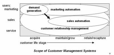
Over the weekend I completed "Demand Generation vs. Customer Relationship Management", the third in my trio of papers explaining where demand generation systems fit into the larger world of customer management software. Like the other two, they are available at the Raab Guide to Demand Generation Systems Web site http://www.raabguide.com/. This one was much easier to write because I was able to draw on the six-task framework established in the first of the trio, "Introduction to Demand Generation Systems". It's all good stuff, in my humble and unbiased opinion. Do take a look.
While writing the new paper I slightly revised the scope diagram I published last week. The new one is below. Changes are subtle--a two-headed arrow and showing some slight overlap between demand generation and sales automation.

Thursday, October 23, 2008
Demand Generation Overview
As I promised (threatened?) in my last post, I've been furiously writing articles to explain demand generation for the new Guide Web site. I just finished #2, the not-very-creatively titled "Introduction to Demand Generation Systems" and posted it there.
I won't recap the piece in detail, but am pleased that it does contain pictures. One illustrates my conception of how demand generation systems fit into the world of marketing systems, as follows:
Is that cute or what?
The others are a pair of flow charts illustrating four tasks within the lead managgement cycle...

... and then how those fit into the larger marketing management process:

Anyway, you probably knew all that. But I do like the pictures.
Monday, October 20, 2008
Marketing Automation vs. Demand Generation: What's the Difference?
One of the first people I told about the new Guide to Demand Generation Systems -- an experienced database marketing consultant, no less -- was receptive to the Guide but asked whether there was any real difference between "demand generation" and "marketing automation" in general. This set off all kinds of alarms, since this was someone who clearly should have been familiar with the distinction.
As with most things, my immediate reaction was to write up an answer. In fact, I've decided I need at least three pieces on the topic: one explaining demand generation in general; one explaining how it differs from marketing automation; and another distinguishing it from customer relationship management (CRM). All this is on top of the piece I was in the middle of writing, on how to cost-justify a demand generation system. These are all fodder for the "Downloadable Resources" section of the new Guide site (have I mentioned in this paragraph that it's http://www.raabguide.com/?), which was looking pretty threadbare at just two pieces.
Anyway, the piece comparing demand generation vs. marketing automation is just finished and posted you-know-where. The short answer is demand generation systems serve marketers who are focused on the lead acquisition and nurturing portion of the customer life cycle, while marketing automation systems serve marketers who are responsible for managing the entire life cycle: acquisition, maintenance and retention. I suspect this distinction will not be popular among some of you, who will correctly point out that demand generation systems can be and are sometimes used for on-going customer management programs. True enough, but I'd still say the primary focus and competitive advantage of demand generation systems is in the pre-customer stage. One big reason demand generation systems aren't really suited for cradle-to-grave customer management: they don't typically capture the sales and service transactions needed to properly target customer communications.
By all means, download the full paper from http://www.raabguide.com/ and let me know your thoughts.
Wednesday, October 15, 2008
Department of the Obvious: Anti-Terrorist Data Mining Doesn't Work
I've emerged from the cave where Osama bin Laden and I were working on the new Guide to Demand Generation Systems (oops -- the Osama part was supposed to be secret) and am now catching up with the rest of the world. One news item that caught my attention described a recent National Research Council report that concluded data mining to find terrorists "is neither feasible as an objective nor desirable as a goal of technology development efforts." See "Government report: data mining doesn't work well" from CNET.
The article pretty much speaks for itself and is no surprise to anyone who is even remotely familiar with the actual capabilities of the underlying technology. Sady, this group is a tiny minority while the rest of the world bases its notions of what's possible on movies like Minority Report and Enemy of the State, and TV shows like 24. (Actually, I've never seen 24, so I don't really know what claims it makes for technology.) So even though this is outside the normal range of topics for this blog, it's worth publicizing a bit in the hopes of stimulating a more informed public conversation.
The article pretty much speaks for itself and is no surprise to anyone who is even remotely familiar with the actual capabilities of the underlying technology. Sady, this group is a tiny minority while the rest of the world bases its notions of what's possible on movies like Minority Report and Enemy of the State, and TV shows like 24. (Actually, I've never seen 24, so I don't really know what claims it makes for technology.) So even though this is outside the normal range of topics for this blog, it's worth publicizing a bit in the hopes of stimulating a more informed public conversation.
Tuesday, October 14, 2008
Sample Guide Entries Now Available on the New Site
The new Guide Web site is now fully functional at www.raabguide.com. Please visit and comment. If you want to make a purchase, even better.
Per yesterday's post regarding the comparison matrix and vendor tables, extracts of both are available on the site (under 'Look Inside' on the 'Guide' page). These will give a concrete view of the difference between the two formats.
I'm sure I'll be adding more to the site over time. For the moment, we have to turn our attention to marketing: press release should have gone out today but I haven't heard from the person working on it. Tomorrow, perhaps.
Monday, October 13, 2008
Free Usability Assessment Worksheet!
I won’t claim a direct cause-and-effect relationship, but is it really just a coincidence that the stock market finally had a good day exactly when my new Guide to Demand Generation Systems is about to be released? Think about it.
That said, the new Guide Web site is in the final testing and should be launched tomorrow. It might even be working by the time you read this: try http://www.raabguide.com/. The Guide itself has been circulating in draft among the vendors for about two weeks. The extra time was helpful since it allowed a final round of corrections triggered by the yes/no/maybe comparison matrix.
I still feel this sort of matrix oversimplifies matters, but it does seem to focus vendors’ attention in a way that less structured descriptions do not. In fact, I’m wondering whether I should drop the structured descriptions altogether, and just show the matrix categories with little explanatory notes. Readers would lose some nuance, but if nobody pays attention to the descriptions anyway, it might be a good choice for future editions. It would certainly save me a fair amount of work. Thoughts on the topic are welcome (yes, I know few of you have actually seen the Guide yet. I’m still considering how to distribute samples without losing sales.)
Part of my preparation for the release has been to once more ponder the question of usability, which is central to the appeal of several Guide vendors. A little external research quickly drove home the point that usability is always based on context: it can only be measured for particular users for particular functions in particular situations. This was already reflected in my thinking, but focusing on it did clarify matters. It actually implies two important things:
1. each usability analysis has to start with a definition of the specific functions, users and conditions that apply to the purchasing organization. This, in turn, means
2. there’s no way to create a generic usability ranking.
Okay, I’ll admit #2 is a conclusion I’m very happy to reach. Still, I do think it’s legitimate. More important, it opens a clear path towards a usability assessment methodology. The steps are:
- define the functions you need, the types of users who perform each function, and the conditions the users will work under. “Types of users” vary by familiarity with the system, how often they use it, their administrative rights, and their general skill sets (e.g. marketers vs. analysts vs. IT specialists). The effort required for a given task varies greatly for different user types, and so do the system features that are most helpful. To put it in highway terms: casual users need directions and guardrails; experienced users like short cuts.
“Conditions” are variables like the time available for a task, the number of tasks to complete, the cost of making an error, and external demands on the user’s time. A system that’s optimized for one set of conditions might be quite inefficient under another set. For example, a system designed to avoid errors through careful review and approvals of new programs might be very cumbersome for users who don’t need that much control.
- assess the effort that the actual users will spend on the functions. The point is that having a specific type of user and set of conditions in mind makes it much easier to assess a system’s suitability. Ideally, you would estimate the actual hours per year for each user group for each task (recognizing that some tasks may be divided among different user types). But even if you don't have that much detail, you should still be able to come up with a score that reflects which systems are more easier to use in a particular situation.
- if you want to get really detailed, break apart the effort associated with each task into three components: training, set-up (e.g. a new email template or campaign structure), and execution (e.g. customizing an email for a particular campaign). This is the most likely way for labor to be divided: more skilled users or administrators will set things up, while casual users or marketers will handle day-to-day execution. This division also matches important differences among the systems themselves: some require more set-up but make incremental execution very easy, while others need less set-up for each project but allow less reuse. It may be hard to actually uncover these differences in a brief vendor demonstration, but this approach at least raises the right question and gives a framework for capturing the answers.
- after the data is gathered, summarize it in a traditional score card fashion. If the effort measures are based on hours per year, no weighting is required; if you used some other type of scoring system, weights may be needed. You can use the same function list for traditional functionality assessments, which boil down to the percentage of requirements (essential and nice-to-have) each system can meet. Functional scores almost always need to be weighted by importance. Once you have functionality and usability scores available, comparing different systems is easy.
In practice, as I’ve said so many times before, the summary scores are less important than the function-by-function assessments going into them. This is really where you see the differences between systems and decide which trade-offs make the most sense.
For those of you who are interested, I’ve put together a Usability Assessment Worksheet that supports this methodology. This is available for free on the new Guide Web site: just register (if registration is working yet) and you’ll be able to download it. I’ll be adding other resources over time as well—hopefully the site will evolve into a useful repository of tools.
Wednesday, October 01, 2008
New Guide is Ready
I've been distracted this week by an unrelated client deadline, but the new Raab Guide to Demand Generation Systems is indeed complete. A proper e-commerce site will be available shortly, but if anyone really can't wait, the salient details are:
- 150+ point comparison matrix and detailed tables on: Eloqua, Manticore, Marketo, Market2Lead and Vtrenz, based on extensive vendor interviews and demonstrations
- price: $595 for single copy, $995 for one-year subscription (provides access to updates as these are made--I expect to add more vendors and update entries on current ones).
- to order in the next few days, contact me via email at draab@raabassociates.com
More details to follow....
Friday, September 05, 2008
More Thoughts on Comparing Demand Generation Systems
I have mostly been focused this week on formats for the new Demand Generation Guide. Since this is of interest to at least some regular readers of this blog, I suppose it’s okay to give you all an update.
The issue I’m wresting with is still how to present vendor summaries. As of last week’s post, I had decided to build a list of applications plus some common issues such as vendor background, technology and pricing. Ease of use was still a nagging issue because ease of use for simple tasks can conflict with ease of use for complex ones.
The only way to resolve this, for me at least, was to actually create a draft entry and see how things played out. This is what I’ve been doing and it has been quite enlightening. What I’ve found is that I can identify a smaller set of applications, and then classify features as applying to simple (basic) forms of those applications, or complex (advanced) ones. I can make a similar basic/advanced distinction for the non-application features (vendor, technology, etc.), which I think I’ll christen as “foundations” for the sake of parallelism. (They also rhyme, in case anybody ever wants to write the song.)
So what I end up with is a two-column matrix that has ‘basic’ and ‘advanced’ as the columns, and horizontal sections for four applications (lead generation, lead nurturing, lead scoring and distribution, and performance measruement) and four foundations (technology, vendor, usability, pricing). Each horizontal section contains multiple rows, where each row lists a specific item such as “import HTML for Web pages” or “a/b testing”. When I looked at the various items of information I have been gathering, it was pretty easy to determine where in this matrix each item belonged. My current version of the matrix has about 140 items altogether, a number that will increase but probably not by much.
Most of these items are pretty close to binary—that is, a system either does it or not. Of course, there are still shades of gray, such as future features or partial implementations. So I’ve chosen a three point scale that boils down to yes, no and kinda. This is precise enough for the purpose at hand.
What I like about this approach is that it gives pretty clear guidance to users who have basic vs. advanced needs for any particular application or foundation. It doesn’t require me to make any particular assumption about who those people are—i.e., that small firms are unsophisticated or big firms have advanced needs. And it lets people mix and match their priorities: somebody might want advanced lead generation but just basic performance measurement.
Careful readers (you know who you are) will have noted that my scheme has transmuted “ease of use” into “usability”. That foundation includes implementation and support services as well as traditional ease of use items of required user skills, steps to complete a process, and marketing asset reusability. These are admittedly more subjective than most of other items in the matrix, but still seem like a step in the right direction. At least I now have a framework that can hold additional, more precise items as I come up with them.
The other big outstanding issue is how to combine the items into summary scores. At present I’m simply adding up the points and calculating a percentage of actual vs. potential points in each category. This doesn’t address the fact that some items are more important than others. Of course, the proper treatment is to assign weights to each item. I may assign those weights myself, or I may just leave that up to Guide readers. Similarly, a single vendor-level score would require assigning weights to the application and foundation categories themselves so their scores can be combined. Here, it’s clearer that each company should assign its own weights—in fact, this weighting is an important part of the decision-making process, so it’s quite important that users do it. But I may assign default weights anyway, because I know people will ask for them, or create different weights for different scenarios. Fortunately, I don’t have to make that decision for a while.
Incidentally, I am not being coy in mentioning the matrix without publishing the details. As much as anything, I’m deterred by the fact that I still haven’t figured out how to load the table into Blogger so it will display properly. (Yes, I do know how to hand code a table in HTML. But I get funky results when I try and haven’t had time to fiddle with it. The HTML that Excel generates automatically won’t work at all.) Once I finalize the matrix itself, I’ll probably include it in a blog post or make it available for download.
Thursday, August 28, 2008
Comparing Demand Generation Systems
Now that I have that long post about analytical databases out of the way, I can get back to thinking about demand generation systems. Research on the new Guide is proceeding nicely (thanks for asking), and should be wrapped up by the end of next week. This means I have to nail down how I’ll present the results. In my last post on the topic, I was thinking in terms of defining user types. But, as I think I wrote in a comment since then, I now believe the best approach is to define several applications and score the vendors in terms of their suitability for each. This is a pretty common method for serious technology evaluations.
Ah, but what applications? I’ve tentatively come up with the following list. Please let me know if you would suggest any changes.
- Outbound campaigns: generate mass emails to internal or imported lists and manage responses. Key functions include list segmentation, landing pages, response tracking, and response handling. May include channels such as direct mail, call center, and online chat.
- Automated followup: automatically respond to inquiries. Key functions include landing pages, data capture surveys, and trigger-based personalized email.
- Lead nurturing: execute repeated contacts with leads over time. Key functions include multi-step campaigns, offer selection, email and newsletters, landing pages, and response tracking.
- Score and distribute leads: assess leads and distribute them to sales when appropriate. Key functions including lead scoring, surveys, data enhancement, lead assignment, and CRM integration.
- Localized marketing: coordinate efforts by marketing groups for different product lines or geographic regions. Key functions include shared marketing contents, templates, version control, campaign calendars, asset usage reports, and fine-grained security.
- Performance tracking: assess the value of different marketing programs, including those managed outside the demand generation system. Key functions include response capture, data imports including revenue from CRM, response attribution, cross-channel customer data integration, and program cost capture.
- Event management: execute marketing events such as Webinars. Key functions include reservations and reminder notices.
There are also some common issues such as ease of use, scalability, cost, implementation, support, and vendor stability. Most of these would be evaluated apart from the specific applications. The one possible exception Is ease of use. The challenge here is the same one I keep running into: systems that are easy to use for simple applications may be hard to use for complex forms of the same application. Maybe I’ll just create separate scores for those two situations—that is, “simple application ease of use” and “advanced application ease of use”. I’ll give this more thought, and look for any comments from anyone else.
Wednesday, August 27, 2008
Looking for Differences in MPP Analytical Databases
“You gotta get a gimmick if you wanna get ahead” sing the strippers in the classic musical Gypsy. The same rule seems to apply to analytical databases: each vendor has its own little twist that makes it unique, if not necessarily better than the competition. This applies even, or maybe especially, to the non-columnar systems that use a massively parallel (“shared-nothing”) architecture to handle very large volumes.
You’ll note I didn’t refer to these systems as “appliances”. Most indeed follow the appliance path pioneered by industry leader Netezza, I’ve been contacted by Aster Data, Microsoft), Dataupia, and Kognitio. A review of my notes shows that no two are quite alike.
Let’s start with Dataupia. CEO and founder Foster Hinshaw was also a founder at Netezza, which he left in 2005. Hinshaw still considers Netezza the “killer machine” for large analytical workloads, but positions Dataupia as a more flexible product that can handle conventional reporting in addition to ad hoc analytics. “A data warehouse for the rest of us” is how he puts it.
As it happens, all the vendors in this group stress their ability to handle “mixed workloads”. It’s not clear they mean the same thing, although the phrase may indicate that data can be stored in structures other than only star/snowflake schemas. In any event, the overlap is large enough that I don’t think we can classify Dataupia as unique on that particular dimension. What does set the system apart is its ability to manage “dynamic aggregation” of inputs into the data cubes required by many business intelligence and reporting applications. Cube building is notoriously time-consuming for conventional databases, and although any MPP database can presumably maintain cubes, it appears that Dataupia is especially good at it. This would indeed support Dataupia’s position as more reporting-oriented than its competitors.
The other apparently unique feature of Dataupia is its ability to connect with applications through common relational databases such as Oracle and DB2. None of the other vendors made a similar claim, but I say this is “apparently” unique because Hinshaw said the connection is made via the federation layer built into the common databases, and I don’t know whether other systems could also connect in the same way. In any case, Hinshaw said this approach makes Dataupia look to Oracle like nothing more than some additional table space. So integration with existing applications can’t get much simpler.
One final point about Dataupia is pricing. A 2 terabyte blade costs $19,500, which includes both hardware and software. (Dataupia is a true appliance.) This is a much lower cost than any competitor.
The other true appliance in this group is DATAllegro. When we spoke in April, it was building its nodes with a combination of EMC storage, Cisco networking, Dell servers, Ingres database and the Linux operating system. Presumably the Microsoft acquisition will change those last two. DATAllegro’s contribution was the software to distribute data across and within the hardware nodes and to manage queries against that data. In my world, this falls under the heading of intelligent partitioning, which is not itself unique: in fact, three of the four vendors listed here do it. Of course, the details vary and DATAllegro’s version no doubt has some features that no one else shares. DATAllegro was also unique in requiring a large (12 terabyte) initial configuration, for close to $500,000. This will also probably change under Microsoft management.
Aster Data lets users select and assemble their own hardware rather than providing an appliance. Otherwise, it generally resembles the Dataupia and DATAllegro appliances in that it uses intelligent partitioning to distribute its data. Aster assigns separate nodes to the tasks of data loading, query management, and data storage/query execution. The vendor says this makes it easy to support different types of workloads by adding the appropriate types of nodes. But DATAllegro also has separate loader nodes, and I’m not sure about the other systems. So I’m not going to call that one unique. Aster pricing starts at $100,000 for the first terabyte.
Kognitio resembles Aster in its ability to use any type of hardware: in fact, a single network can combine dissimilar nodes. A more intriguing difference is that Kogitio is the only one of these systems that distributes incoming data in a round-robin fashion, instead of attempting to put related data on the same node. It can do this without creating excessive inter-node traffic because it loads data into memory during query execution—another unique feature among this group. (The trick is that related data is sent to the same node when it's loaded into memory. See the comments on this post for details.)
Kognitio also wins the prize for the oldest (or, as they probably prefer, most mature) technology in this group, tracing its WX2 product to the WhiteCross analytical database of the early 1980’s. (WX2…WhiteCross…get it?) It also has by far the highest list price, of $180,000 per terabyte. But this is clearly negotiable, especially in the U.S. market, which Kognitio entered just this year. (Note: after this post was originally published, Kognitio called to remind me that a. they will build an appliance for you with commodity hardware if you wish and b. they also offer a hosted solution they call Data as a Service. They also note that the price per terabyte drops when you buy more than one.)
Whew. I should probably offer a prize for anybody who can correctly infer which vendors have which features from the above. But I’ll make it easy for you (with apologies that I still haven’t figured out how to do a proper table within Blogger).
______________Dataupia___DATAllegro___Aster Data___Kognitio
Mixed Workload_____Yes________Yes________Yes________Yes
Intelligent Partition___Yes________Yes________Yes________no
Appliance__________Yes________Yes________no________no
Dynamic Aggregation__Yes________no_________no________no
Federated Access_____Yes________no_________no________no
In-Memory Execution__no________no_________no________Yes
Entry Cost per TB___$10K(1)___~$40K(2)______$100K______$180K
(1) $19.5K for 2TB
(2) under $500K for 12TB; pre-acquisition pricing
As I noted earlier, some of these differences may not really matter in general or for your application in particular. In other cases, the real impact depends on the implementation details not captured in such a simplistic list. So don’t take this list for anything more than it is: an interesting overview of the different choices made by analytical database developers.
Wednesday, August 06, 2008
More on QlikView - Curt Monash Blog
I somehow ended up posting some comments on QlikView technology on Curt Monash's DBMS2 blog. This is actually a more detailed description than I've ever posted here about how I think QlikView works. If you're interested in that sort of thing, do take a look.
Tuesday, August 05, 2008
More on Vertica
I finally had a conversation with columnar database developer Vertica last week. They have done such an excellent job explaining their system in white papers and other published materials that most of my questions had already been answered. But it’s always good to hear things straight from the source.
The briefing pretty much confirmed what I already knew and have written here and elsewhere. Specifically, the two big differentiators of Vertica are its use of sorted data and of shared-nothing (MPP) hardware. Loading the data in a sorted order allows certain queries to run quickly because the system need not scan the entire column to find the desired data. Of course, if a query involves data from more than one column, all those columns be stored in the same sequence or must be joined on a common ID. Vertica supports both approaches. Each has its cost. Shared-nothing hardware allows scalability and allows redundant data storage which simplifies recovery.
Our conversation did highlight a few limits that I hadn’t seen clearly before. It turns out that the original releases of Vertica could only support star and snowflake schema databases. I knew Vertical was star schema friendly but didn’t realize the design was required. If I understood correctly, even the new release will not fully support queries across multiple fact tables sharing a dimension table, a fairly common data warehouse design. Vertica’s position is that everybody really should use star/snowflake designs. The other approaches were compromises imposed the limits of traditional row-oriented database engines, which Vertica makes unnecessary. I suspect there are other reasons people might want to use different designs, if only to save the trouble of transforming their source data.
On a somewhat related note, Vertica also clarified that their automated database designer—a major strength of the system—works by analyzing a set of training queries. This is fine so long as workloads are stable, but not so good if they change. A version that monitors actual queries and automatically adjusts the system to new requirements is planned for later this year. Remember that database design is very important to Vertica, since performance depends in part on having the right sorted columns in place. Note also that the automated design will become trickier as the system supports more than start/snowflake schemas. I wouldn’t be surprised to see some limits on the automated designs as a result.
The other bit of hard fact that emerged from the call is that the largest current production database for Vertica is 10 terabytes. The company says new, bigger installations are added all the time, so I’m sure that number will grow. They added that they’ve tested up to 50 TB and are confident the system will scale much higher. I don’t doubt it, since scalability is one of the key benefits of the shared-nothing approach. Vertica also argues that the amount of data is not a terribly relevant measure of scalability—you have to consider response time and workload as well. True enough. I’d certainly consider Vertica for databases much larger than 10 TB. But I’d also do some serious testing at scale before making a purchase.
Subscribe to:
Posts (Atom)


